Block Editing

cc-licensed untitled image by flickr user Gabriel Cardenas
WordPress 5.0 was released in early December and features a modern, new editor called “Gutenberg” that replaces the “Classic” editor that has been around for years. Gutenberg is one of the biggest and most controversial changes in WordPress history, and the web is filled with articles, both pro and con. Gutenberg’s user experience will certainly become slicker and more intuitive as WordPress evolves – Gutenberg is still quite new and takes a little effort to get use to, but offers many new ways to design pages with complex layouts and new elements.
We really hope that you will start using Gutenberg – you’ll find that it can do powerful things!
The editor breaks up content that you create into blocks. Everything is a block – paragraphs, images, lists, embeds, short codes, columns, cover images, etc. – and each block has numerous properties that determine how it appears on the page. Blocks can be moved up and down or added anywhere you want without the use of custom code.
Gutenberg aims to eliminate the need for certain plugins and change the way themes and plugins are designed. As said in the WordPress.org introductory page, it’s “the foundation that’ll revolutionize customization and site building in WordPress.”
For those not up for this change, you can always go back to the Classic editor. While we don’t encourage going back to the old way, since new WordPress theme and plugin development will focus on building Gutenberg blocks and the Classic editor will only be supported for three years, we realize this is a major change for sites on the Commons and the learning curve is not inconsequential.
WordPress editors are user specific – on the same site some users can use the Classic editor and some use Gutenberg.
Our Update Strategy
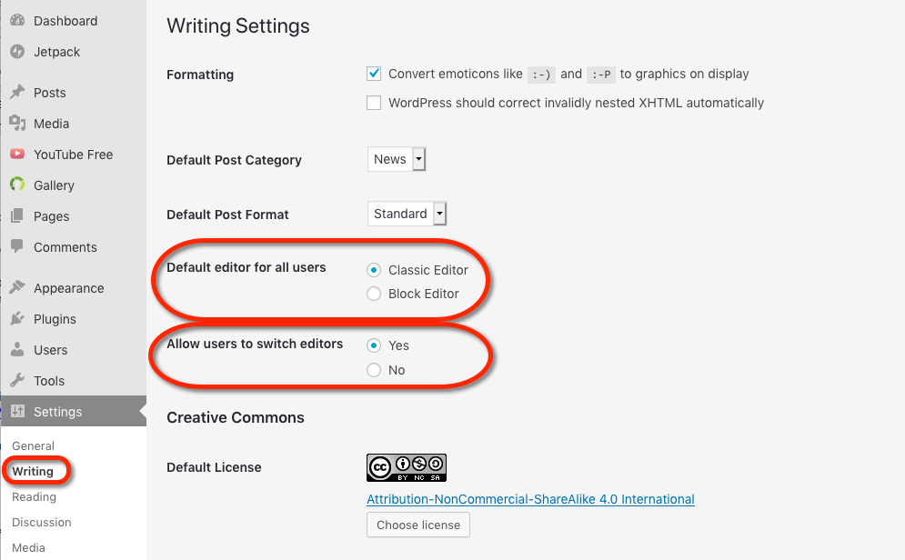
The Commons will make both editors available. Admins of a site control whether users can switch editors. They can also determine which editor is the default. These are found in the dashboard under Settings>>Writing.
- For sites created before January 22,2019, “Default editor for all users” will be set to Classic Editor.
- For sites created on or after January 22,2019, “Default editor for all users” will be set to Block Editor.
- The Commons will by default always set “Allow users to switch editors” to Yes.
Admins can of course change these defaults according to their needs.
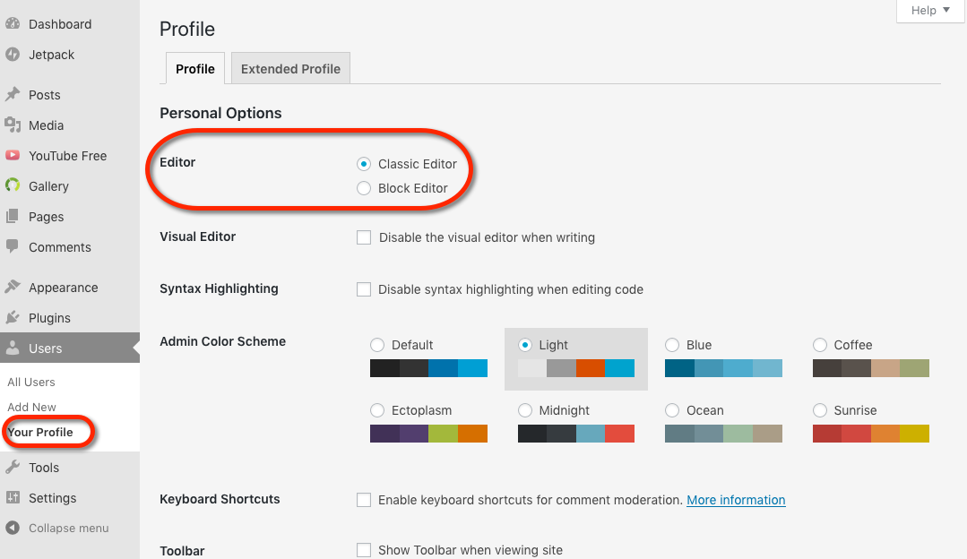
If the admin of a site allows editor switching, an individual user can choose either one of the editors to be their default. This setting is found on Users>>Your Profile
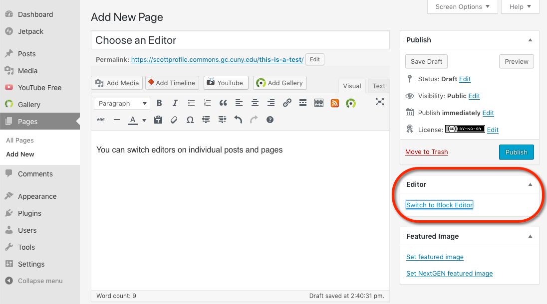
And finally, if the admin of a site allows editor switching, even if users set a default editor, they can switch editors on individual posts and pages.
If wanted, old posts and pages can be converted into blocks and edited via Gutenberg. Click on the three dots in the upper right corner of the editor and select “Convert to blocks.” This will also switch editor to Gutenberg.
Getting Started With Gutenberg
Things have moved around with the new editor. This is what you’ll see when you first begin a post:
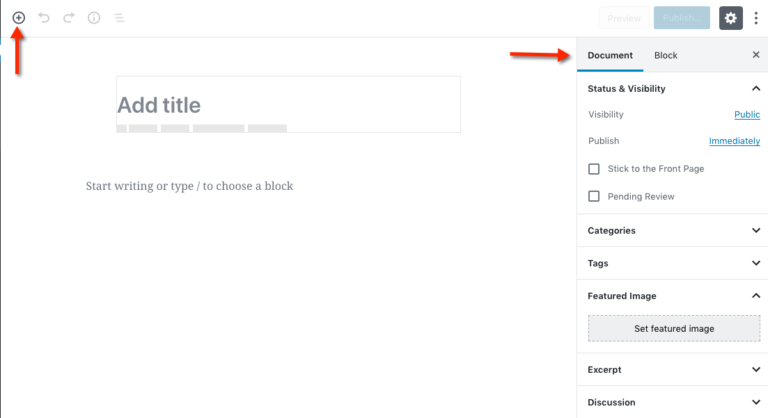
When dealing with the post as a whole, click on the “Document” tab. When you highlight a block, the “Block” tab will automatically appear and you will be able to change that block’s attributes.
Blocks are stacked on top of one another and you can move blocks up or down as you please. Some blocks let you have have an inner block – a block within a block – such as the column block.
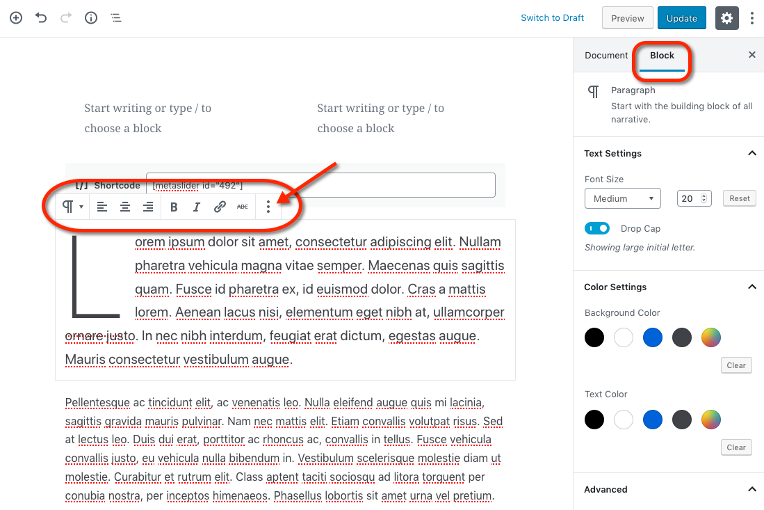
In the example below, the paragraph block as been highlighted and and you can see in the right sidebar where you can choose font size, color, background color, and drop cap. Additionally, the text menu bar appears, allowing you to perform the familiar text adjustments.
If you click on the three vertical dots (see red arrow), you will see a drop down list that lets you:
- Hide Block Settings (the right sidebar block properties)
- Duplicate
- Insert Before
- Insert After
- Edit as HTML
- Add to Reusable Blocks
- Delete Block
Twenty Nineteen Theme
Every year the WordPress team comes out with a new default theme – this year it is especially designed for Gutenberg. The team describes it as follows:
“At the core of Twenty Nineteen is its simple, sophisticated typography. The theme’s aesthetic is minimal and non-prescriptive, allowing the theme to work well in a variety of applications. For example: it is effective as an minimal, typography-driven blogging theme, but can also be adapted for use as a static business website.”
Useful Tutorials
Gutenberg has been in the works for a while and there are many posts on the web that you can check out. WordPress.org has a great introductory page that animates the creation of some commons blocks and lets you try creating blocks on your own. There is also a good tutorial on WP Beginner. CodeInWP also has a good one. Undoubtedly, there are many more.


Comments are closed.