Just over two years ago, with our 2.0 release of an overhauled homepage, we began to steadily revamp the look of the Commons. As we launch a new Groups experience today, every major area of the site now utilizes the modern and streamlined design we introduced in spring 2022.
The full suite of Groups features, from discussion forums to shared file repositories, are a foundation of the community-driven and collaborative elements at the core of the platform. They’re also some of its most complex. After many months of refining and reimagining each feature, we’re very excited to put them in your hands.
Keep reading for a rundown of the changes and a look at how far we’ve come!

The Group Landing Page
Though there are many ways to join and interact with a Group (more on that below), a group’s landing page is the one-stop shop to learn about its people and projects.
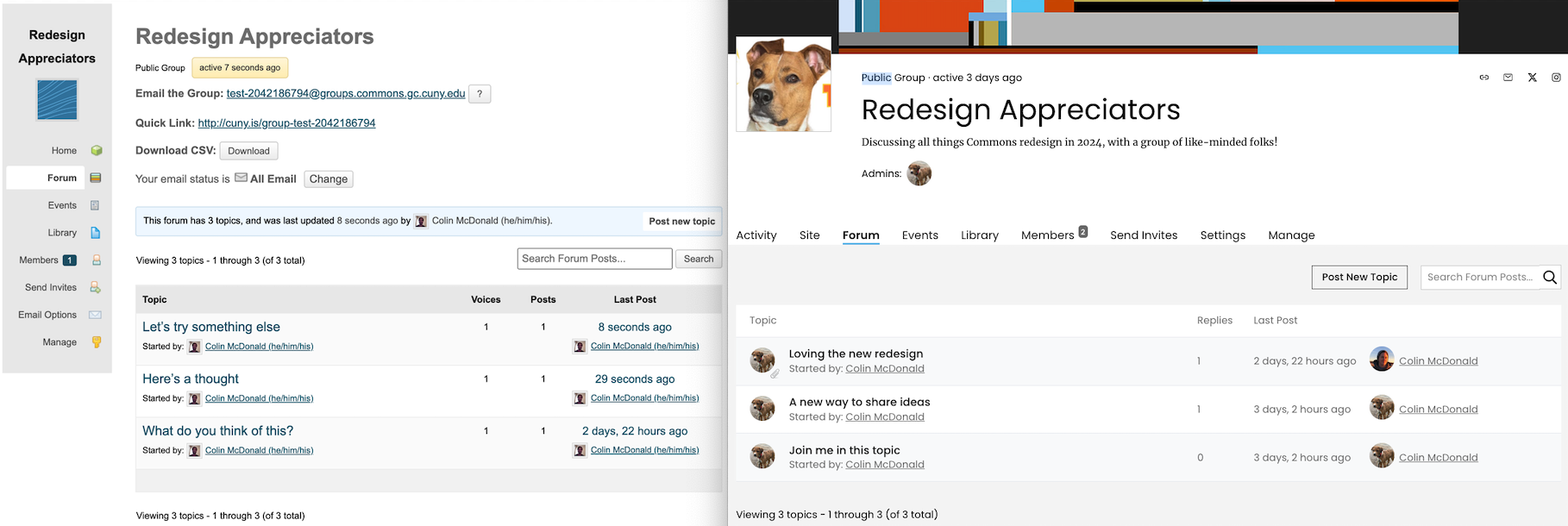
The redesign makes all of this easy to access while maintaining a minimalist, organized feel. As you can see in the side-by-side comparison above, the left-hand sidebar of our previous layout has given way to a versatile and space-efficient tabbed interface, with more definition between each element and a bit more flair as well!
The new layout even borrows from our CV launch earlier this year and incorporates a full-width cover image up top. Group admins can upload a custom image or choose from a gallery of original art by the inimitable Ryan Seslow to help set the visual tone of their Group.
Below the cover image is the Group’s square profile or avatar image alongside fields for key metadata, social media and contact links (which become handy icons up near the cover image), and the group description and admin information to round out the header.
Under the header is a tabbed interface that may be familiar to you by now from elsewhere in our series of redesign releases. Starting with Activity, visitors can tab through the other top-level features that are essential to most Groups: Forum, Events, Library, Members, and Settings (though their default visibility depends on the Group’s privacy settings).
Discussing, Sharing, Connecting
The interface for working with the many features of a Group has been painstakingly refreshed; you can visit our help site for a detailed description of this functionality). Here’s how we’ve redesigned the forum and the library:


As the central areas for managing conversations and shared files, respectively, the forum and library are pillars of the Group experience. Both take advantage of the full-width real estate below the tabbed navigation to display clear titles, member and descriptive information, as well as search and filter tools.

We have also redesigned popups, forms, and other areas for adding and editing Group content. The interface for creating a new forum post at right is now an easy-to-access popup, for example. We put a special emphasis on heavily- and widely-used elements like this, ensuring they were easy to navigate and access across any device.
Refreshed Admin Panel
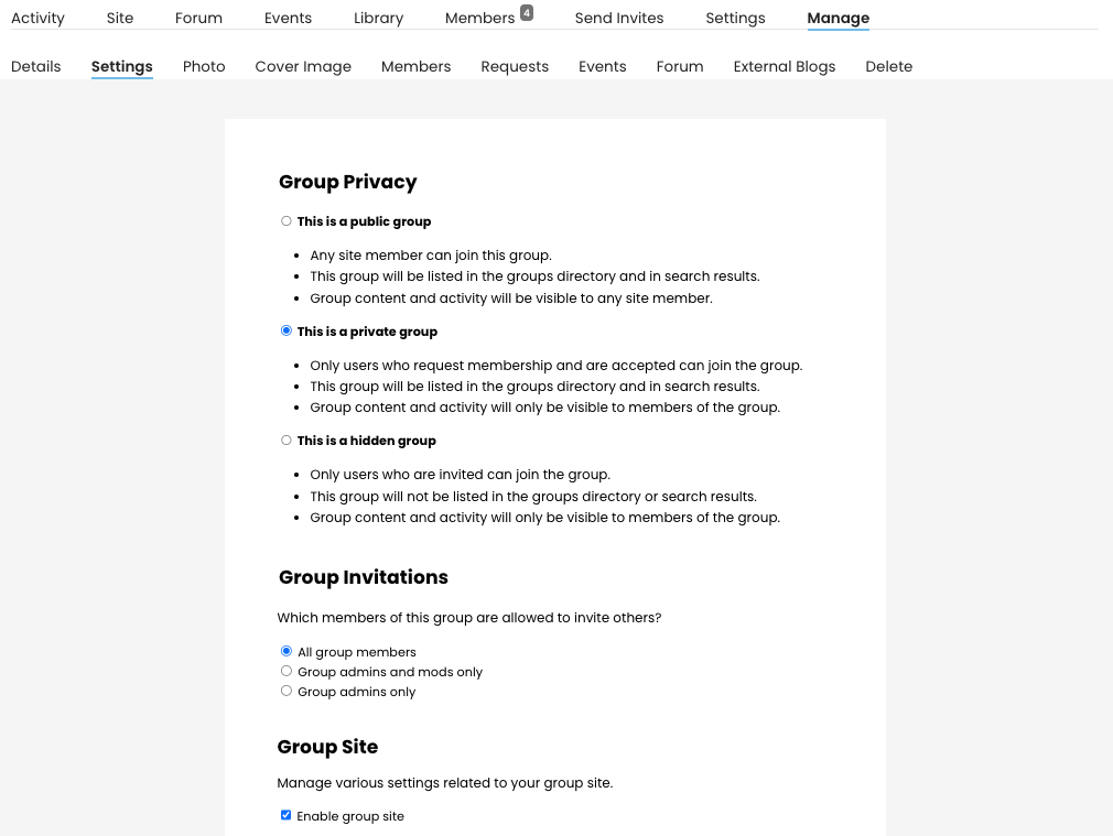
If you are the admin of a Group, at the end of the top row of tabs, you’ll see a Manage tab that opens a second row where you can access the variety of ways to customize a group. These tabs all sport a unified look, flowing from our redesign’s visual principles.
Of the many important options here (see our documentation for the full rundown), one of the most crucial is privacy and invitation settings:


In the Manage > Members tab, admins have the ability to change the roles and permissions of the Group’s members, as well as removing and blocking users from the group. For large groups, there is also a search box to filter and find members.
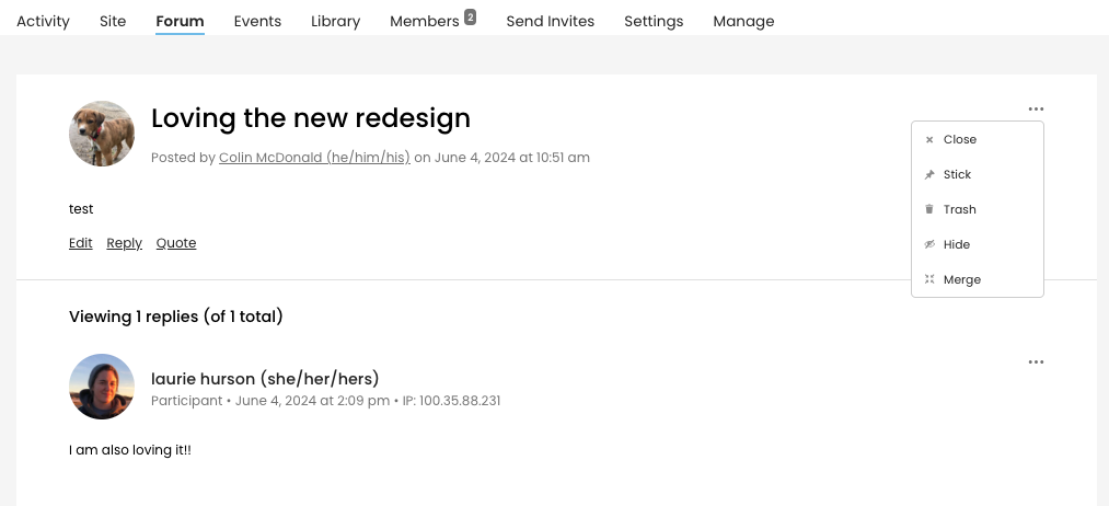
Admin features also appear in a couple of other Group locations outside of the Manage tab. For example, an admin opening any individual forum post in their group can access a menu to close the topic to new replies, stick it to the top of the list of forum topics, trash it and queue it for deletion, hide it (can be restored later), and merge it with another forum topic.

New Group, New Look
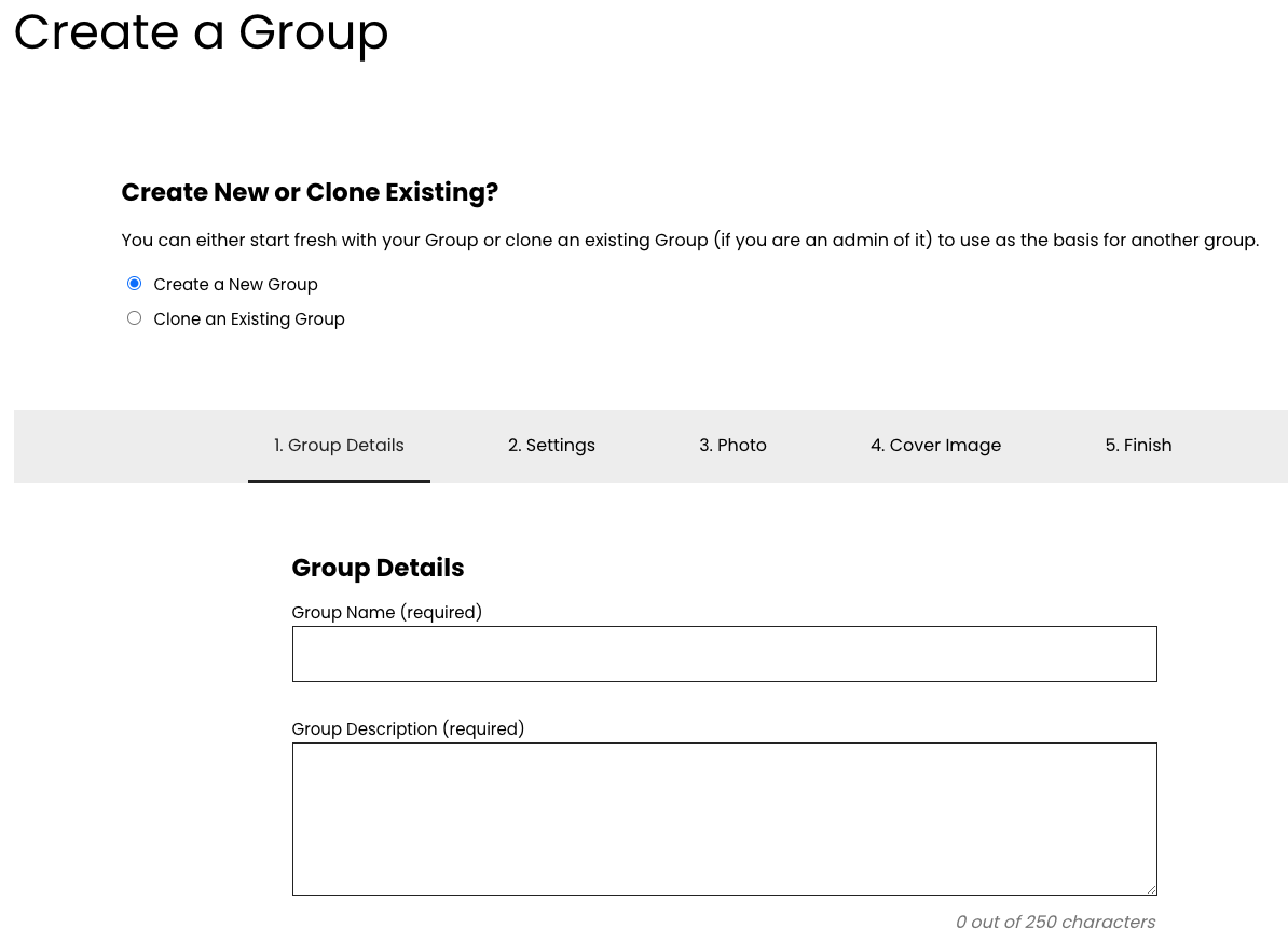
As part of this release, we’ve also made the creation steps for a new Group, Site, or Group + Site consistent with our redesign. It’s now easier than ever to start up a new space on the Commons and configure it right from the start to work well with your next project!

After making your way through each step, you’ll know you’re in the right place when you’ve reached a Commons staff favorite among all of our new graphics – the “Congratulations” screen!

Glad You Could Join Us!

We’ll close with one more look back at where this redesign journey began, with a before and after of the Commons homepage we officially refreshed in January 2022. After almost four years of preparing and polishing each rollout (catch up on all of our releases in the news blog), we’re proud to have updated the design of each Commons vertical. Users can now enjoy a modern, consistent look across the platform!
We hope you’ll enjoy playing with everything this release has to offer you and your Groups, those already active and those yet to come. Please let us know what you think of this or any other aspects of our redesign.
Happy summer, and we’ll see you in the fall for the next chapter of Commons improvements!
Post featured image: A crowd of colored squiggles by readerwalker on Flickr (CC).


Comments are closed.