It’s a new year, and we’re thrilled to kick it off by unveiling a big new feature. Today, we say goodbye to the traditional Commons Profile and hello to the Commons CV!

The CV (curriculum vitae) is a versatile, visually compelling public landing page available to every Commons member. Using intuitive and customizable editing tools, you can display your key educational and professional experiences, your skills, your contact information, and anything else that you’d like to share about yourself as you seek new positions.
We’ve migrated the information of users with existing profiles in the old format to the new CV format, so it’s easier to start working with right away. New members and those with no prior profile information can create a new CV and build it out within minutes. You can read more below about the different parts of the CV and how to create one that’s truly your own.
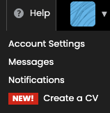
This release pairs with the Fall 2.2 release that included redesigned settings and account functionality, resulting in a complete overhaul of how members manage their public presence on the Commons.
We can’t wait to see new CVs take shape across the Commons, and we’re already hard at work on another large set of upgrades for the spring. Check back here for more later this semester!
Touring the CV
The more we explored how to refresh the Commons Profile, the more potential we saw for providing the CUNY community with a robust, modern, and beautiful web presence that can be easily updated. Students and faculty are often in need of a place to present their work and other personal and professional information in ways that might not be possible on more specialized or restrictive social networks or academic sites. The CV strikes a balance between offering a layout familiar to any colleague or employer while also featuring bold visual elements and deep levels of customization, all without the need to build out a standalone portfolio website.
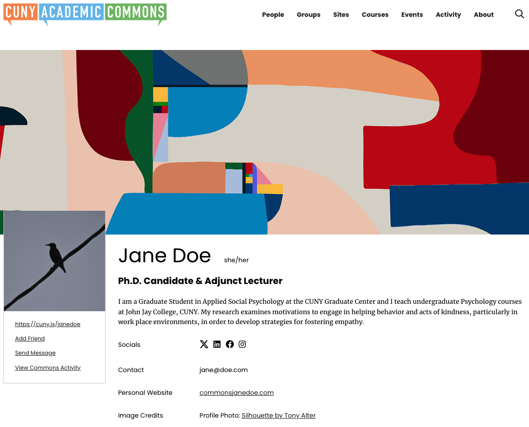
It all starts, just as with many elements of the ongoing Commons redesign, with imagery to catch the eye and set the tone right up top. The CV has a large customizable cover image overlapped by a square profile image. Commons members can upload any image they’d like to these slots, though for the cover image one can also choose from a set of original pieces created by the artist and professor Ryan Seslow, who also runs the amazing Net-Art site on the Commons (we also used one of his pieces as for this post’s thumbnail on our homepage).
These images frame a basic top section for important details like a short bio, social media accounts, website links, and contact information. There is always the option of omitting an item based on what you’d like to share (see below for more on using the editing tools).
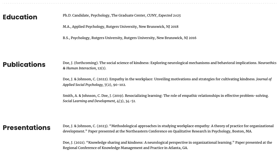
The bottom section consists of a series of two-column sections. The first column simply contains a section header, like Education or Publications, and the second column is a list of relevant items. You can duplicate, build out, reorder, rename, delete, and add sections as needed.
Creating and Editing
For all that’s gone into the CV’s clean and engaging public presentation, there’s a similar investment in its editing tools, which make full use of the WordPress block editor, a.k.a. Gutenberg.
If you’re not familiar with this editor, it allows for WordPress pages and posts to be created by populating and arranging a series of content blocks, ranging from simple ones like Paragraph and Image to more complicated ones like Columns that are meant to be combined with other blocks.
Changes can essentially be made right on the page itself, rather than having to go to a dashboard or backend, because the editing interface closely resembles how the elements will appear when published. This removes the need for a lot of previewing or concern for how the finished CV will look to the public. You can save your CV as a draft while you’re working on it, publish it when you’re finished, and revert back to a draft at any time to privately make further updates.
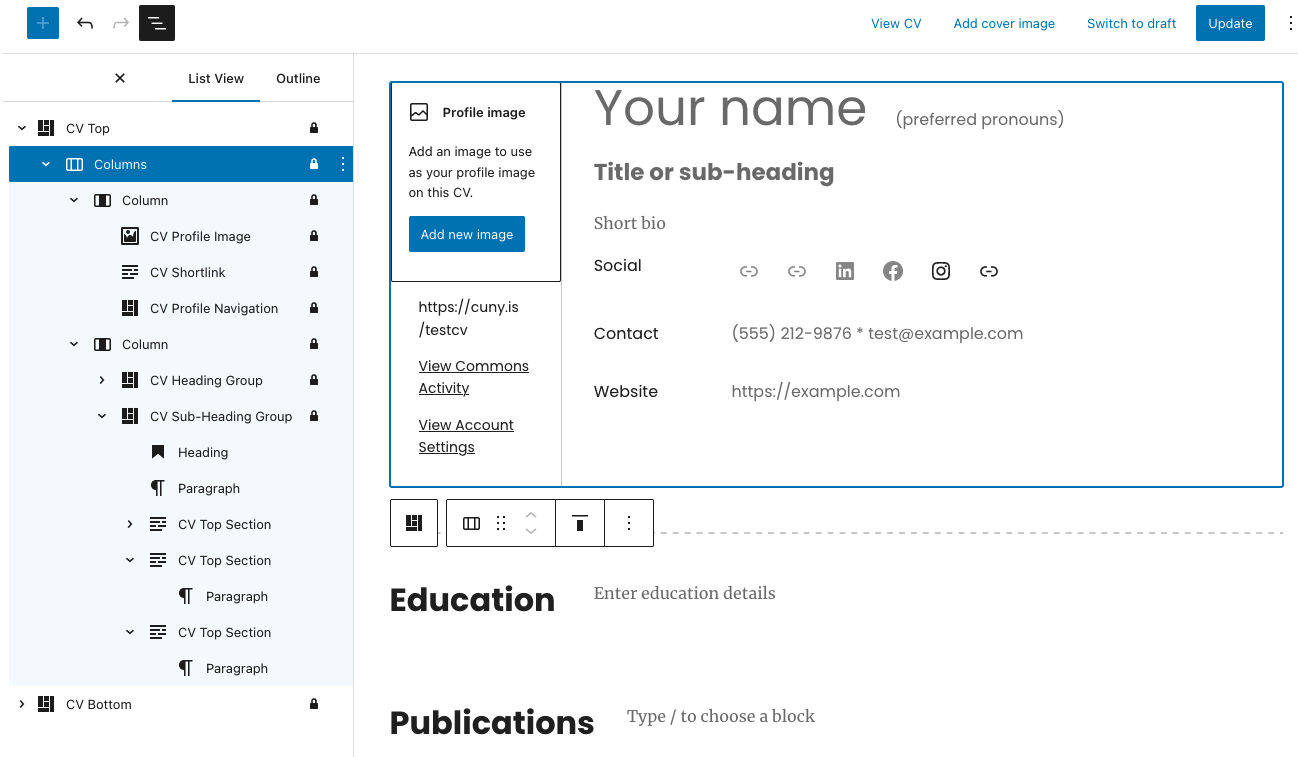
When you log in to edit or create your CV, you’ll be using a set of CV-specific blocks created for this release as well as standard blocks. Below is a look at the block editor with its left-hand “List View” sidebar displayed to show the sequence and nesting of the blocks in use. The list view makes it easier to understand the structure of the CV, jump around to different parts for editing, and rearrange blocks as necessary. Please note that many higher-level blocks are “locked” (with a lock icon next to them) in order to preserve the overall framework of the CV for more consistent display to the public.
You can add your content directly into the blocks on the right-hand side, where placeholder text serves as a guide for what to enter. Closing out of the List View sidebar provides a more streamlined view, especially on mobile devices.
Because of the visual nature of all this, the best way to start learning how to use the CV editor may be watching the short video walkthrough of the main features below. You also can dig in further using our documentation.

Profile Header vs. CV
If a Commons member has published a CV, you’ll be sent to it right away if you click on their name/photo in the Directory or elsewhere on the Commons. If they don’t yet have a CV, you’ll instead be taken to a page with a header section that displays a few key details as well as buttons for adding them as a friend or sending a message (all CVs also have a link to this page for that member).
You can edit the content or visibility of your own header in your Account Settings and the Edit Profile tab, as seen below for a member who has yet to publish a CV.
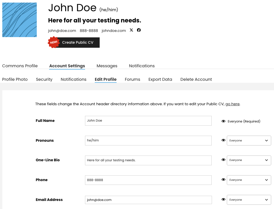
If you haven’t published a CV yet, take a few seconds to add your essential information in your Account Settings for your fellow members’ reference in the meantime. If you have an active CV, you should also ensure that it matches your information in this header.
Happy CVing!
We can’t wait to hear what you think and see what you build with this new feature. Contact us here with any questions or feedback, and we’ll be back in the spring with another exciting round of improvements!


Comments are closed.